")


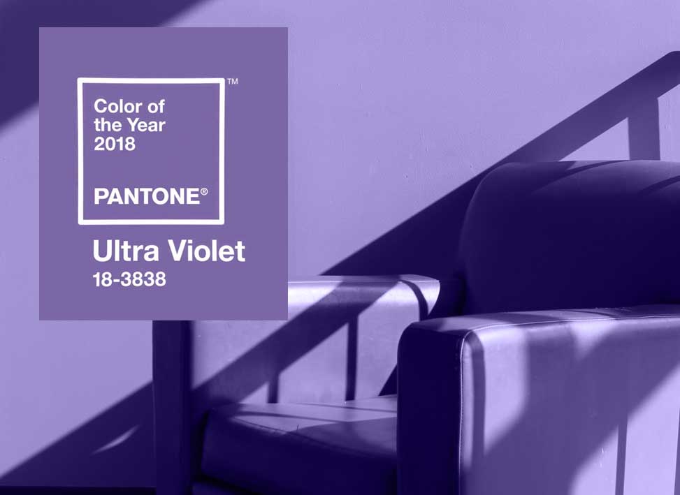
Colours are more than just about aesthetics. They carry a message, a powerful statement about their surroundings. With that in mind, It´s time to explore the Colour of the Year 2018 chosen by the Pantone Institute.
The end is the beginning of something new. Entering the new year, we tend to reflect on what lies behind us and what lies ahead. What have the last 12 months brought upon us? What do we wish for in 2018.
The Pantone Colour Institute entered an energetic future full of originality. With their colour choice of the year, they create space for visionary thinking and lay ground for the artistic and the creative.
Although Ultra Violet is not always easy to use in the world of branding, it can be the icing on the cake, the highlight to something special. The blue-toned purple stands for the mysteries of the cosmos, a galactic and indulgent force, the colour of the night, able to inspire those in its universe.
The mindful colour is hence often used within a sphere of spirituality and meditation symbolizing individuality and imagination. Laurie Pressman, Vice President of the Pantone Color Institute states: „The Pantone Color of the Year has come to mean so much more than ‘what’s trending’ in the world of design; it’s truly a reflection of what’s needed in our world today.”
Ultra Violet in Graphic Design and Packaging
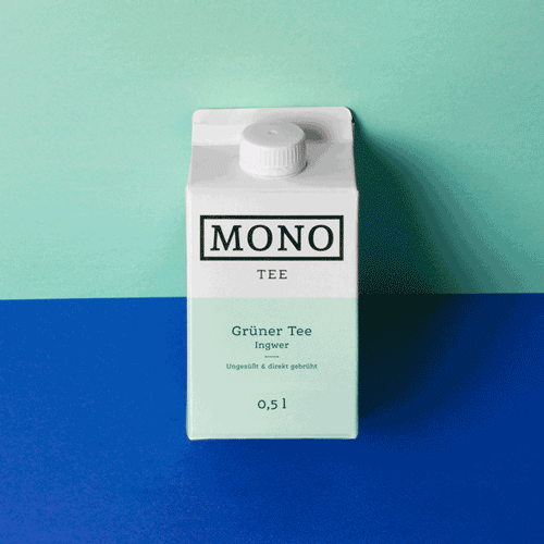
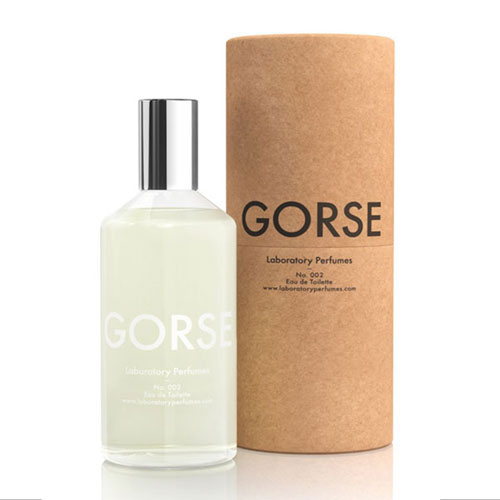
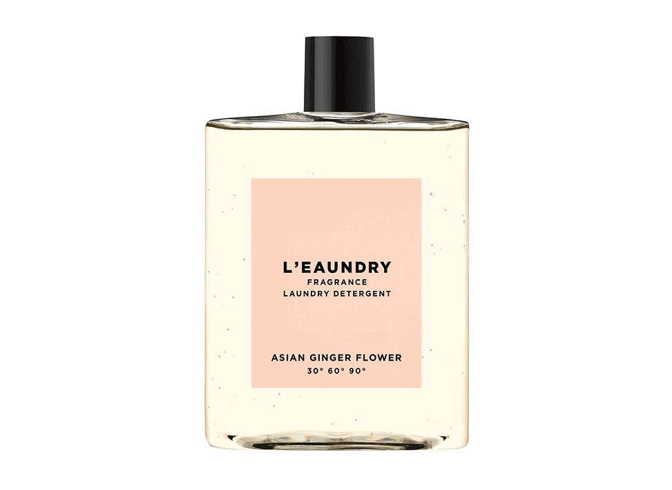
Seeking to stand out? Ultra Violet elements may give your product and packaging a vibrant and unexpected appeal. “As packaging design becomes more sophisticated, Ultra Violet offers complexity and nuance that appeals to our desire for originality in all that we touch. (Pantone Institute). Greens, greys and ombres make a good fit for the dazzling colour and are also welcome in the heart of beauty and home décor.